
Designing for Place: Making Real Estate Projects Feel Rooted, Not Generic
The strategic framework behind the KB Realty Vision Evening at ADOT by GNH, Gurugram
Glass, some aluminium, a few “iconic” fins, a grand gate, a pool somewhere. It could be in Gurgaon, Goa, Dubai, or a Tier-3 town, you wouldn’t know the difference.
For buyers and investors, that’s a problem.
For developers, it’s a missed opportunity.
This is where place-led design comes in: designing a project so it feels like it belongs to its location, instead of looking like it has been cut and pasted from a catalogue.
At Sepia Advertising and its real estate vertical CoPRES – Consortium for Professional Real-Estate Solutions, “place” is not a moodboard word. It’s a filter we apply across concept, aesthetics, capital and go-to-market.
This blog is a straightforward look at what “designing for place” actually means, and how developers can use it to build projects that are easier to sell and age better over time.
What happens when you ignore place
When a project is designed in isolation from its surroundings, a few typical issues show up
1. It looks imported, not anchored
A façade inspired from another city or country might look impressive in a render, but on ground it can feel:
- Too cold for a spiritual town
- Too busy for a quiet residential neighbourhood
- Too flashy for a serious business district
Buyers may like it at first glance but struggle to emotionally place it in the city they know.
2. It fights the climate
Ignoring climate leads to:
- Large glazed surfaces in harsh sun
- Outdoor features that are unusable half the year
- Wind and rain conditions handled as an afterthought
This affects both comfort and running costs. Over time, the building ages badly and feels tiring, not premium.
3. It misses how people actually live and move
If you don’t map how people will:
- Arrive
- Park
- Walk
- Wait
- Sit
- Pray, shop, dine, work, or relax
…you end up with spaces that photograph well but feel awkward or inconvenient in daily use.
4. It wastes a location advantage
A good plot in a heritage town, on a main approach road, near a natural feature, or next to a landmark should feel like it has grown from that advantage.
When design is generic, the project might as well have been built anywhere else. You lose free value the location was already giving you.
What is “place-led design” in real estate?
Place-led design is simple:
Design the project so that anyone who sees or enters it thinks,
“This could only be here, not anywhere else.”
It’s not about copying local motifs blindly or making everything “theme-based”. It’s about looking at five things with intent:
- Location – physical setting, access, edges, views, immediate neighbours
- Culture – how people in and around that area live, work, worship, socialise
- Climate – sun, wind, rain, dust, heat, cold
- Market – who the buyer is and what they consider “good taste”
- Use – what will actually happen there every day, not just on the brochure
A place-led project may be contemporary or traditional, quiet or bold, but it feels right for the site.
The core elements of place-led design
Here are some practical layers developers should look at, even before the detailed architectural work begins.
- Site and surroundings
Ask basic questions:
- What does the site “see”? City, fields, temple spires, water, hills, traffic?
- Where are the strongest arrival points and vistas?
- What’s on the edges, chaotic streets, calm lanes, institutional neighbours?
- Movement and experience
Walk the site as if you were:
- A resident entering daily
- A guest visiting occasionally
- A staff member working there
- A buyer seeing it for the first time
- Climate and materials
Simple but often ignored:
- Where does the sun hit hardest?
- Where do you actually get pleasant shade and breeze?
- Which materials age well in this climate and dust level?
You don’t need to be “vernacular” in a token way. You just need to be honest about sun, rain, and maintenance.
- Culture and habits
This matters more than most people admit.
- In a pilgrimage town, what does respect look like in built form?
- In a business district, what does seriousness look like?
- In a resort, what does effortless ease look like?
The aim is not stereotype. It’s to ensure the project doesn’t feel tone-deaf for its context.
- Public realm and shared spaces
Lobbies, entries, streets inside the project, courtyards, terraces, club decks, these shape how people perceive the project’s character.
Place-led thinking here includes:
- How open or closed should the project feel to the street?
- Where can you allow small moments, seating, shade, pause, visuals, that feel naturally local?
- How will people take photos here? (Because they will.)
- Signage, wayfinding, and identity on ground
Fonts, colours, signage forms, and icons should echo the overall design language.
If the architecture is calm and restrained but the on-ground branding is loud and mismatched, the whole project feels disjointed.
Applying place-led design to different project types
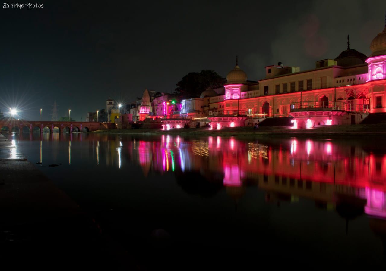
- Destination and pilgrimage projects
For projects in temple towns, heritage belts, or spiritual circuits:
- Respect the skyline and key views
- Use calm, coherent forms rather than noisy decoration
- Allow for processions, gatherings, and visitor flows in planning
- Reflect local language and symbols in a simple, modern way, not overdone pastiche
This is exactly where contextual aesthetics matters. It’s not “theme”. It’s dignity and fit.
- Urban infill and city projects
Here, the challenge is:
- Tight sites
- Existing neighbours
- Traffic and noise
Place-led design can:
- Use setbacks, edges, and façade treatment to “negotiate” with the street
- Offer a sense of refuge inside without turning into a fortress
- Respect the existing urban grain while still being recognisably new
- Resort and second home projects
Resorts in hills, coastal belts, or nature-led destinations often fall into one of two traps:
- Overbuilt “hotel boxes” with no sense of place
- Over-themed “fake village” visuals
Place-led design here focuses on:
- Views, light, and the experience of moving through the landscape
- Scale and clustering of units
- Honest materials that fit the setting
- Allowing the site itself to do some of the work
Why this matters for developers
Designing for place is not about making projects sentimental or slow. It’s about making them clear, honest, and differentiated.
Projects that are rooted in their location:
- Age better
- Suffer less from trend fatigue
- Are easier to position in a crowded market
- Hold value more consistently for both buyers and promoters
If you are planning a serious project, whether in a metro, a growth corridor, or a destination town, the question is simple:
Do you want a building that could have been anywhere,
or a project that clearly belongs where it stands?
Place-led design is how you make that choice visible.