

Amrit Vichar commissioned Sepia Advertising Pvt. Ltd. to develop a campaign encouraging newspaper reading in Lucknow households. The assignment covered campaign strategy, Hindi copywriting and creative direction, with everyday reading as its central subject. Pasted text
The final campaign addresses three reading situations: understanding a complete story, following the city’s news and setting aside personal reading time. Each advertisement uses a different headline and visual, supported by the same campaign sign-off:
फिर घर लाए अखबार,
अमृत विचार!
The art direction combines a CMYK-inspired colour palette with Indian maximalist imagery and simple illustrated characters.
The Brief: Encourage Everyday Newspaper Reading
The brief focused on the newspaper’s place in the household. Amrit Vichar wanted communication that gave people a practical reason to pick up the paper, read it and discuss its contents.
The audience included younger readers, women, people following Lucknow’s local affairs and families sharing a newspaper. Sepia organised the communication around their reading situations: seeking more context, taking time for oneself and keeping up with the city. Pasted text
Lucknow provided the campaign’s geographical focus. Hindi copy and familiar visual references supported that local relevance, while one execution addressed the city directly.
The campaign concentrated on the uses of newspaper reading rather than comparisons with digital media. Price remained visible, but it did not lead the communication.
One Sign-Off Across Three Executions
फिर घर लाए अखबार,
अमृत विचार!
Phir Ghar Laye Akhbar, Amrit Vichar!
The sign-off asks readers to bring the newspaper home again. It appears inside a white speech bubble with a black outline, giving all three advertisements a recurring visual element.
The opening headlines address different reader situations. The sign-off connects each message to Amrit Vichar.
The approved artwork places “दैनिक समाचार पत्र @ ₹5/-” beneath the speech bubble. This identifies the product as a daily newspaper and communicates its price without making price the campaign’s main proposition.
Across the three advertisements, the headline, background colour and central image change. The speech-bubble treatment, newspaper masthead and illustrated characters maintain continuity.
The Three Campaign Executions
Reading Beyond the Headline
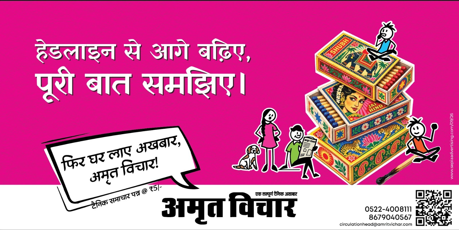
हेडलाइन से आगे बढ़िए,
पूरी बात समझिए।
Headline se aage badhiye, poori baat samjhiye.
Developed with students and younger readers in mind, this execution encourages reading beyond the headline. The copy asks for fuller understanding without criticising other ways of accessing news.
The words “बढ़िए” and “समझिए” use a respectful, direct form of address. The two-line structure keeps the message short enough to sit prominently within the advertisement.
The magenta composition features stacked, decoratively illustrated Indian matchboxes. Animal imagery, portraiture, floral borders and patterned surfaces give the objects their maximalist treatment. Small characters sit around the stack, including a newspaper reader.
The headline occupies the left side of the horizontal layout, while the matchboxes and characters occupy the right. A white lower band carries the Amrit Vichar masthead and circulation information.
Keeping Up With Lucknow
लखनऊ है अपना, खबर है रखना।
Lucknow hai apna, khabar hai rakhna.
This execution makes the local proposition explicit: knowing what is happening in Lucknow.
The cyan composition centres on an ornate gramophone with floral decoration across its horn and cabinet. Small illustrated figures read and interact around it.
The gramophone is part of the campaign’s Indian maximalist visual language. The city reference comes through the headline; the object does not need to serve as a literal Lucknow landmark.
The advertisement retains the speech-bubble sign-off and the functional footer used in the horizontal format.
Personal Reading Time
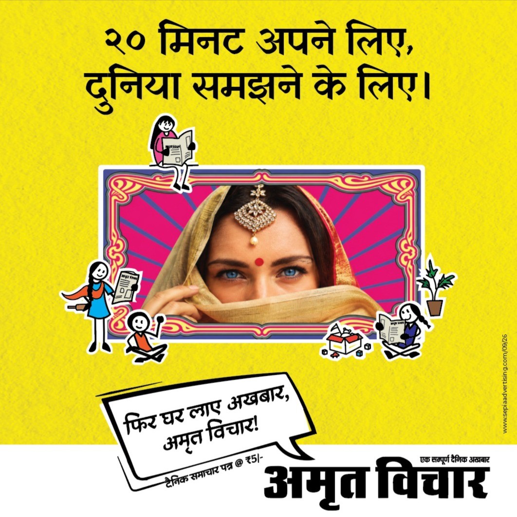
२० मिनट अपने लिए,
दुनिया समझने के लिए।
20 minute apne liye, duniya samajhne ke liye.
This execution was developed around women readers and personal reading time. The twenty-minute reference gives the invitation a specific duration, linking time for oneself with staying informed.
The yellow vertical layout features a photographic portrait inside an ornate frame. Small illustrated newspaper readers appear around it, accompanied by household details.
A supporting line appears in this execution:
एक अखबार | पांच पाठक | दस बातें | एक परिवार
It expresses the idea of a newspaper being shared within a household. The numbers are campaign language, not a measured readership claim.
The portrait, headline and household message give this advertisement a different composition while retaining the campaign’s colour, character and sign-off conventions.
CMYK and Indian Maximalism
A Colour Reference to Print
The palette is an homage to CMYK. Magenta, cyan and yellow provide the dominant backgrounds. Black appears in the masthead, character outlines and typography.
This connects the campaign’s visual identity to the print medium. It also gives each advertisement a distinct colour without separating it from the other executions.
The colour fields remain relatively open around the headline. Decorative detail is concentrated in the central imagery, keeping the copy legible despite the density of the illustrations. Pasted text
Decorative Objects and Simple Figures
Indian maximalism provides the campaign’s main artistic direction. The matchboxes, gramophone and portrait frame use ornament, pattern, saturated colour and layered detail.
The small characters use a simpler drawing style: black outlines, limited facial detail and clear poses. They read newspapers, sit beside objects and interact within the compositions.
This contrast is consistent across the campaign. The larger images carry the decorative detail; the smaller figures introduce readers and household activity.
The visual treatment combines illustration, decorated objects and photographic portraiture. It does not depend on a conventional photograph of someone holding a newspaper.
Hindi Copy and Layout
The copy was developed as short, two-line statements. Each headline introduces a specific subject: complete reading, local news or personal time.
One recurring decision was to keep “अखबार” out of the opening headlines. The word already appears in the sign-off, so avoiding it at the top reduces repetition and gives each headline its own vocabulary. Wording was also refined for rhythm and form of address. Pasted text
The layout separates campaign communication from contact information. The upper area carries the headline, central image and speech bubble. A white lower band carries the newspaper identity and practical details.
That footer is adapted to the format. All three supplied executions include the masthead, QR code and circulation contact information. The vertical yellow advertisement also includes the Lucknow office address and newspaper website.
The ?5 descriptor remains beneath the speech bubble rather than becoming part of the headline.
Developing the Campaign
Copy and visual development proceeded through several rounds. Early directions explored price-led messages and broader newspaper-brand statements. The final selection concentrated on specific reading situations, with price retained as supporting information. Pasted text
Visual exploration included everyday objects, decorative frames, poster references and different character treatments. The final artwork uses the matchbox, gramophone and framed portrait compositions.
During refinement, attention was given to character scale, anatomy, expression and interaction with the larger objects. These adjustments helped maintain a consistent illustration style across the advertisements.
The supplied final artwork includes two horizontal executions and one vertical execution. Their arrangements differ, but the headline hierarchy, speech-bubble treatment, illustrated figures and newspaper identity remain recognisable across formats.
Sepia’s Scope and Final Output
Sepia’s work covered campaign strategy, concept development, audience communication, Hindi copywriting, art direction, illustration direction, visual development and campaign adaptation. Pasted text
The final output is a three-execution campaign for Amrit Vichar’s Lucknow communication. Each advertisement presents a specific reason to read, supported by a shared colour and illustration system.
The case study documents the strategy and creative development. No circulation, subscription or readership results are reported.
Campaign strategy, copy and creative direction by Sepia Advertising Pvt. Ltd.
For campaign enquiries, contact Sepia Advertising Pvt. Ltd.
.png)