

Sepia Advertising Pvt. Ltd. built the jewellery brand strategy, identity and launch direction for Yutara, an accessible everyday-jewellery brand with a planned store in Bareilly and online sales at the centre of its plan. The work set the positioning, "Your Everyday Essentials," and the launch campaign, "Stack. Style. Repeat."
This brand strategy case study covers the brief, the positioning, the product architecture, the pricing principle, the brand identity design, the retail and online direction, and the launch campaign. Each section records a decision and the reason behind it.
The article documents strategy and creative development only. It reports no sales, repeat-purchase or campaign-performance figures.
The Brief: A Jewellery Brand Strategy for Store and Online
Yutara needed a brand identity and commercial direction that could support two channels at the same time: a physical store in Bareilly and an online business.
The brief set four clear requirements:
- An accessible brand with contemporary design
- Comfortable products suited to everyday wear
- Consistent presentation across retail and digital
- A defined pricing principle: communication would focus on the products and their styling, without making-charge promotions
Why the Online Channel Shaped the Identity
Bareilly was the first retail market, but online sales were central to the business plan. The identity therefore had to introduce Yutara to customers who had never visited the store.
That changed the job of the identity. It could not rely on the store to explain the brand. Product images, packaging and campaign communication each had to carry Yutara on their own, with the same clarity and the same voice.
Sepia's assignment was set up accordingly. Alongside the visual identity, it covered the customer proposition and the launch approach: the decisions an identity exists to express.
Brand Positioning: Your Everyday Essentials
Your Everyday Essentials.
The positioning places Yutara inside everyday personal style. Jewellery is presented as something customers select, combine and wear regularly.
The line defines the role of the product. It gives the brand a natural way to talk about daily wear, outfit choices and styling combinations. It also leaves room for individual collections to have their own design direction without drifting from the core idea.
Organising the Brand Around Use
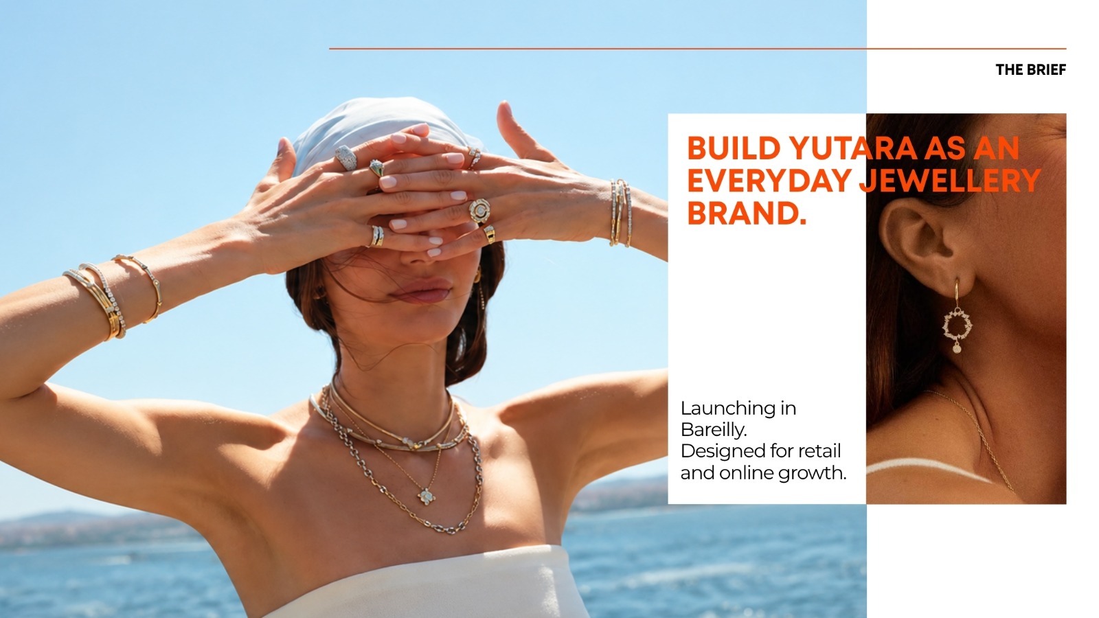
Yutara's marketing and branding strategy starts from one question: how will the jewellery be used?
Comfort, ease of wearing and aesthetics were requirements in the brief. Sepia made them the terms in which every product is presented and described. The communication shows jewellery being worn and combined, and product information supports the purchase decision.
This is a practical choice for a brand that sells online. A customer on a product page cannot try a piece on. Showing how a piece sits, pairs and stacks answers the question a store assistant would otherwise answer.
Benchmarking
Research discussions reviewed Indian and international jewellery brands. One international everyday-jewellery brand served as the main benchmark for everyday-wear positioning.
The review focused on three areas:
- how products are presented
- how the brand speaks
- how styling informs the customer's purchase
The findings shaped how Yutara would present and describe its range.
Product Architecture: Essentials and Collections
The proposed merchandising structure separates a continuing range from seasonal releases.
- Yutara Essentials covers core pieces intended to stay relevant beyond any single campaign.
- Yutara Collections provides a structure for seasonal releases and new designs.
Why Two Tiers
The split gives the brand two distinct types of product communication. Core pieces can appear regularly in styling content, so customers see them worn in many combinations. Collection releases introduce new products and new pairings, which gives the brand fresh material at each season.
Together, the two tiers give Yutara a working model for marketing and brand management after launch. The Essentials range provides continuity. The Collections provide news.
The structure also supports merchandising. In the store and online, core pieces form a stable base, while collections change around them.
Pricing Without Making-Charge Promotions
In much of Indian jewellery retail, the price of a piece combines the value of the material with a making charge for labour and design. Promotions often centre on discounts to that charge.
Yutara's brief ruled this approach out. Each product carries a stated selling price. Communication focuses on the piece's design, its wearability and its place within the range.
The reasoning is straightforward. Promotions built on making-charge discounts make price the subject of the brand's communication. A fixed selling price keeps the subject on the product.
The First-Order Incentive
The launch plan considered a first-order incentive to support initial purchases. It was given a narrow role: acquisition.
The offer was a promotional component, not the basis of the brand. Seasonal releases and styling content, not discounts, were planned as the recurring subjects of Yutara's marketing.
Visual Identity: Brand Identity Design Across Every Surface
The identity work covered the Yutara wordmark, the emblem, the colour palette and a set of supporting patterns.
Colour Palette
The selected palette is led by two cool tones and supported by three neutrals and finishes:
- Periwinkle, a lead colour
- Pale lavender, a lead colour
- Warm white, for space and contrast
- Deep ink, for type and definition
- Silver finishes, for packaging and applied details
These colours form the base for packaging, retail and digital applications.
Emblem, Patterns and Applied Elements
Development included emblem variations, repeat motifs, packaging ribbons, tape and storefront studies. The priority was usability. The identity had to work at the scale of a ribbon, a strip of tape or a product thumbnail, and equally at the scale of a shopfront.
Each element was tested across sizes and materials. An emblem that works on signage but fails on a ribbon is not a usable identity, so the studies covered both.
Packaging Design
Packaging concepts considered how individual purchases would be presented, as well as the brand's wider appearance.
For a delivered order, the packaging is the customer's first physical contact with Yutara. The concepts therefore treated packaging as a brand touchpoint in its own right, carrying the palette, the emblem and the patterns into the customer's hands.
Retail Branding and Digital Applications
Signage and retail studies examined how the identity would sit inside a physical environment. Digital applications addressed how the same elements would appear alongside product images and campaign copy.
These applications were developed as part of the brand presentation. The retail concepts and mock-ups document the proposed direction. They are not completed store installations or manufactured packaging.
Retail and Online Direction: One System, Two Channels
The retail concept follows a fashion-boutique approach. Browsing, product discovery and styling are the priorities.
The product architecture supports this directly. Core pieces, new collections and suggested combinations can guide how the range is displayed. Customers see individual products alongside the pieces that can be worn with them.
Planning an Online Jewellery Brand
The online direction uses the same organising principles. Product presentation, collection content and styling guides were planned as connected parts of one customer experience.
Planning Yutara as an online jewellery brand meant both channels had to share:
- One identity, applied consistently across store and screen
- One product language, with Essentials and Collections named and presented the same way
- One styling logic, showing combinations in the store and online
- One packaging system, carrying the brand into both store purchases and delivered orders
The work established this direction without assuming that the retail and ecommerce operations were already live.
The Launch Campaign: Stack. Style. Repeat.
STACK. STYLE. REPEAT.
The launch campaign centres on how customers wear the products. Stacking, the practice of wearing several pieces together, gives the brand a practical and visual subject for both advertising and product content.
The line is built as a sequence of three verbs. It describes an action the customer can take today. "Repeat" also connects the campaign back to the positioning: these are pieces meant to be worn again and again.
The launch plan was organised into three areas: brand communication, product education and sales communication.
Brand Communication
"Stack. Style. Repeat." serves as the main campaign line.
The creative direction focuses on jewellery combinations and how they fit into everyday dressing. Individual pieces appear within styled selections, while the headline stays constant.
This gives the launch a defined visual subject: the products, the combinations and the way they are worn.
Product Education: Stacking 101
Stacking 101 was developed as the educational component of the launch.
The proposed content explains how pieces can be combined, layered and styled. It creates space for close product views and practical demonstrations, without requiring a promotional offer in every post.
The series also links the campaign to the range. Products introduced through advertising can be shown in more detail within the styling content, so customers see exactly how a piece works before they buy it.
Sales Communication
The sales component addresses first purchases and specific products.
A first-order offer was considered within the launch plan, supported by direct product communication. Its purpose was limited to acquisition. The ongoing brand direction stays focused on design, collections and styling.
How the Three Parts Work Together
The three areas share one campaign idea but perform different tasks:
- Brand communication introduces Yutara and its point of view.
- Product education explains how the pieces are worn.
- Sales communication gives the customer a reason to make a first purchase.
Keeping these roles separate protects the brand. The campaign line stays about style, the education content stays useful, and the offer stays in its own lane.
Development: Strategy First, Identity Second
The project was developed through positioning discussions, competitor references, identity studies and campaign planning.
The main strategic decisions came first:
- The everyday-essentials position
- Fixed product pricing
- Seasonal product communication through Collections
- An emphasis on online sales
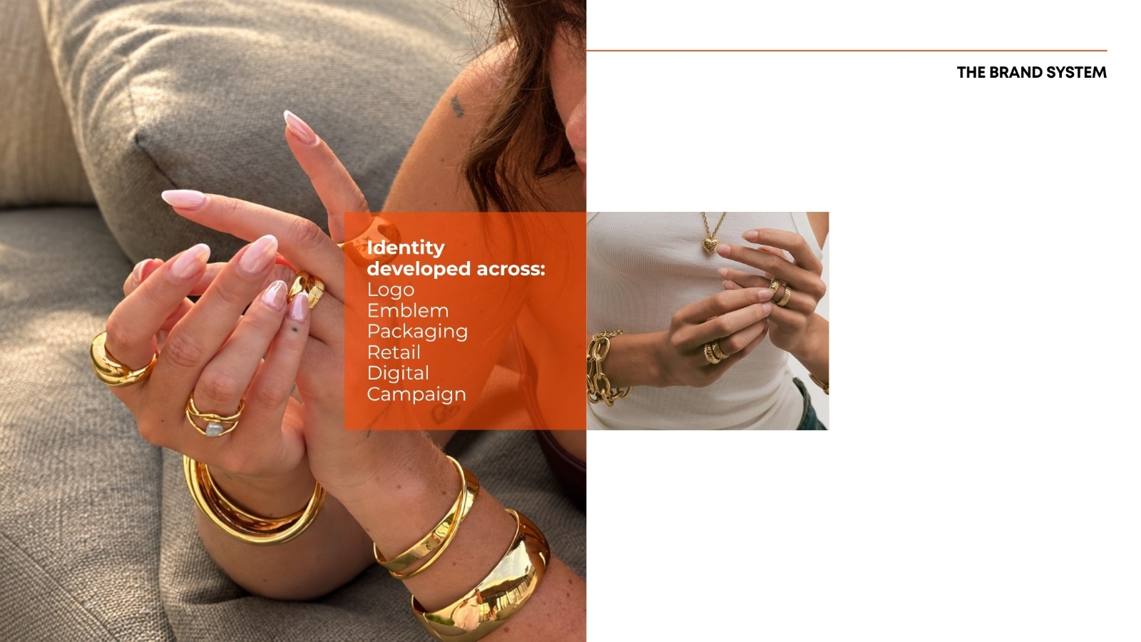
Identity and application studies then tested how those decisions would appear in packaging, retail and campaign material. The order matters. The identity expresses decisions that were already made, which is why every visual element has a clear job.
Sepia's Scope
Sepia Advertising Pvt. Ltd. is a strategy-led advertising agency and branding agency in Noida. On the Yutara assignment, Sepia's scope covered brand strategy, positioning, product architecture recommendations, visual identity, packaging direction, retail concepts and launch communication. This case study does not cover store build-out, ecommerce operations or packaging manufacture.
The work follows Sepia's Strategy / Brand / Market approach. The strategy defined the position, the product architecture and the pricing principle. The brand work built the identity and its applications. The market work planned the launch across brand communication, education and sales.
The Brand Direction
The result is a complete brand direction for Yutara and a structured campaign for introducing its products. Every element points to the same idea: jewellery that customers wear every day, combine freely and return to.
The positioning names that idea. The product architecture organises it. The fixed pricing protects it. The identity and packaging carry it into the store and the delivery box. The launch campaign turns it into an action: stack, style, repeat.
This is a strategy and creative case study. It does not report sales, repeat-purchase rates or campaign performance. For founders comparing a branding agency India-wide, the relevant evidence is in the decisions and the reasoning shown here.
Brand strategy, identity and launch direction by Sepia Advertising Pvt. Ltd.
If you are building a new brand and need the strategy, identity and launch to work as one, book a consultation with Sepia to talk through your plans.
.png)